Japan Is Bigger Than You Think
Is it just us who thought Japan was a lot smaller than this? When it’s put up against the US, it really shows how massive this country actually is. We mean, it makes sense, with how much of Japan is pure mountains and rainforests.
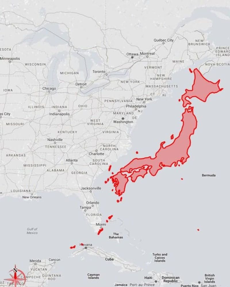
With the population sitting at around 122 million, it adds up. As it turns out, Japan is just under 378,000 square kilometers, but 92% of the Japanese population lives in the urban areas of the country. We wonder what other countries are bigger or smaller than we think.
Valued Capitalism by State
Let’s face it — we’re all a sucker for some big-name brands, right? Well, this map has figured out which brands are most famous in each US state. Some of these make perfect sense, like Apple for California, as that’s where the headquarters are.
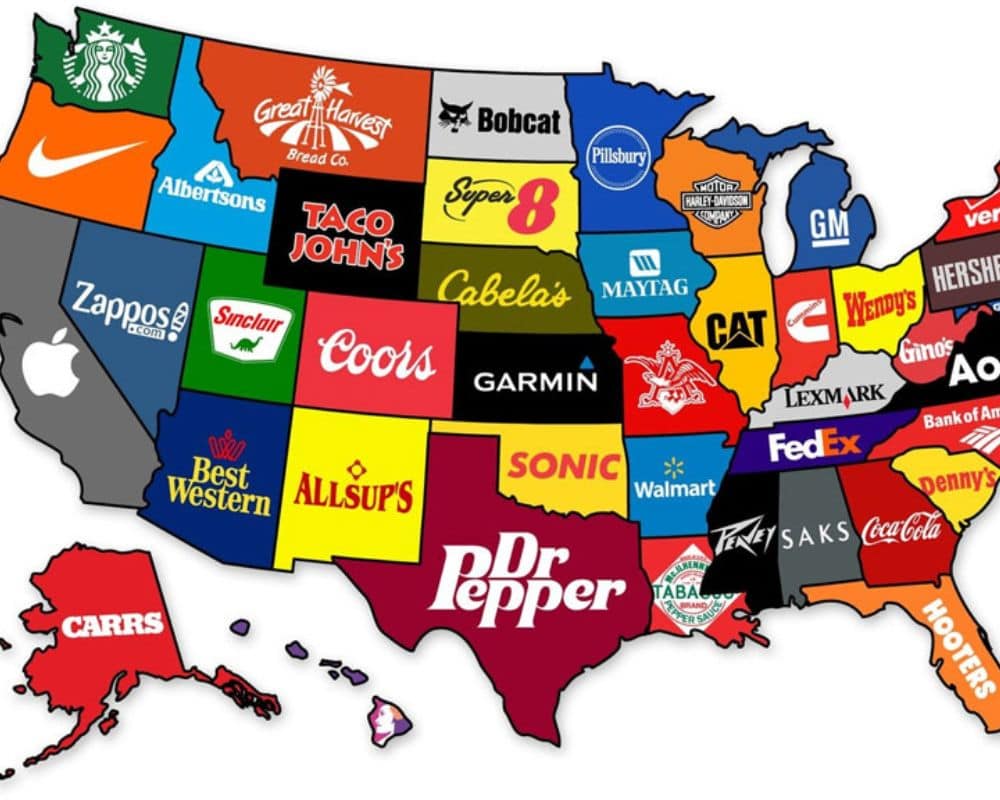
The creator of this map, Steve Lovelace, says he chose the brands depending on whether they simply had ties to the state or were incredibly popular amongst the state’s population. Dr Pepper in Texas threw us off, but it turns out it was invented there. Who knew?
Remarkable Population Dispersion
How cool is this? Each colored section of this map indicates where 10% of the population lives. It’s interesting to see which areas have a really dispersed and spread-out population, whereas some areas are really packed and dense.
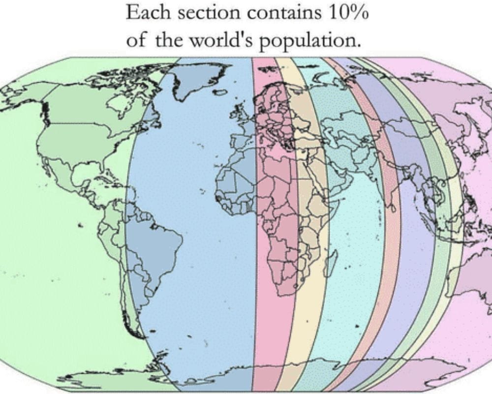
To put it into perspective, the thinner slices in Asia hold the same amount of the world’s population as the eternity of the green slice in the Americas. However, a lot of that is the Pacific Ocean, where, of course, there are fewer places to reside.
Where Are All the Redheads?
This map shows where the majority of redheads live throughout Europe. To no surprise, the most populated redhead areas are in Ireland and Scotland. Currently, anywhere between 10% and 30% of the world’s redheads live in Ireland, and outside Europe, there are only 0.06%.
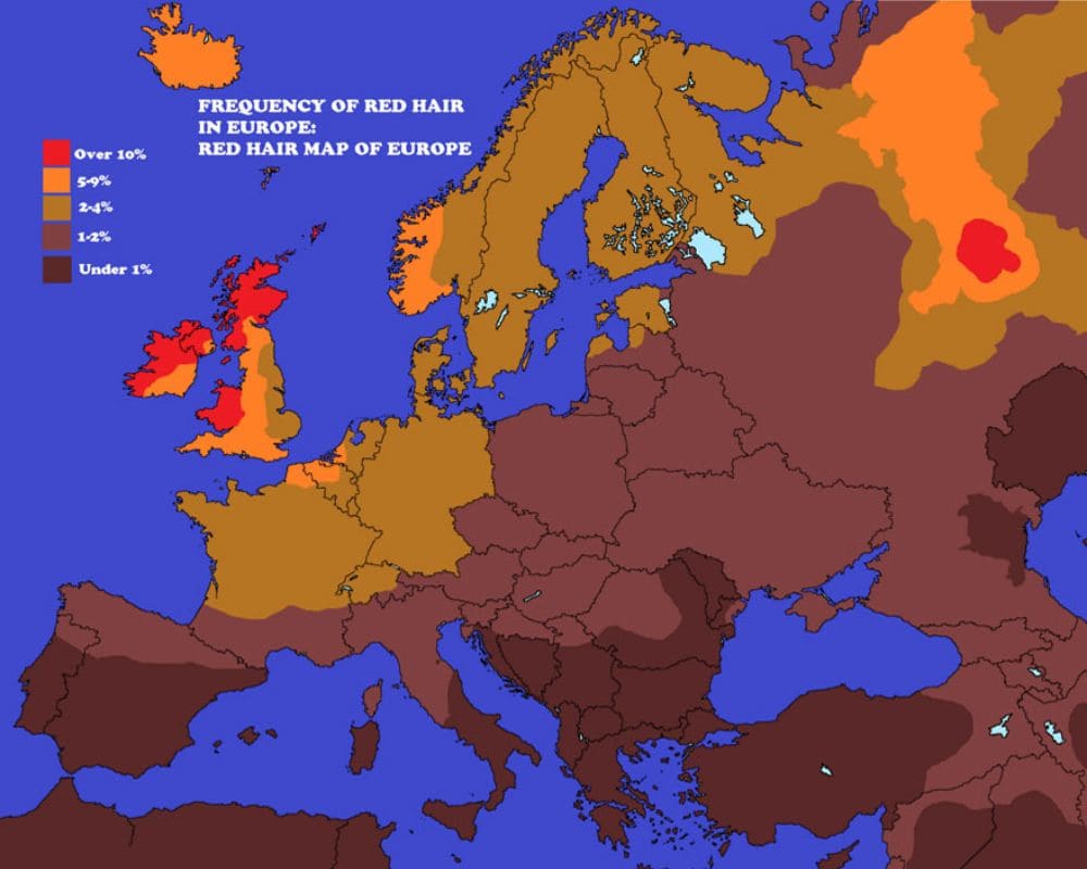
Interestingly, there are a few in Western Russia, and the rest slowly disperses from Western Europe all the way East. Hey, redheads — at least you now know where you can find more people like you in Europe.
Empty Land
Maybe it’s common knowledge, but perhaps some people will be surprised to learn that half of Canada’s population lives below that red line. The three big cities under the red line are Toronto, Canada’s biggest city, Montreal, and Ottawa, the capital.
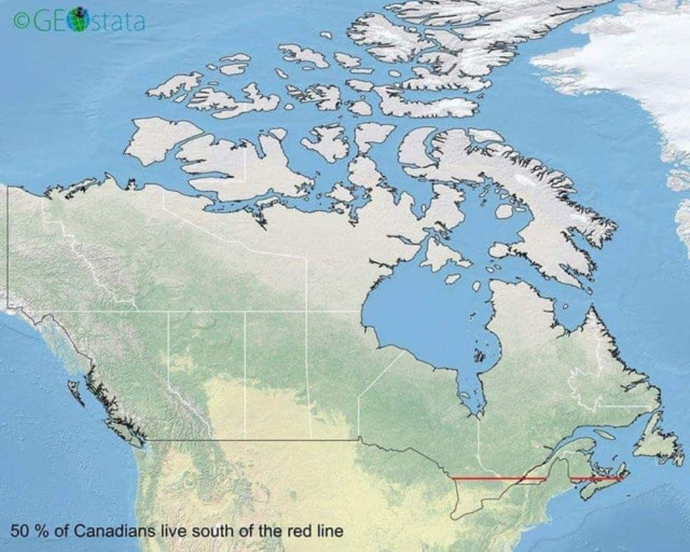
Spread out throughout the rest of Canada, there are other big cities that are, for the most part, in the South of the country. We’ve got Winnipeg, Calgary, and Edmonton. To put it into perspective, 13.8 million Canadians live in either Toronto, Montreal, or Ottawa. Whereas, about three million live in the other big cities throughout Canada.
Browsing History
What web browser do you use? Well, take a look at this map and find out which countries use the same as you. As you’ll see, the majority of the population uses Google Chrome, which makes sense. Second best seems to be Internet Explorer.
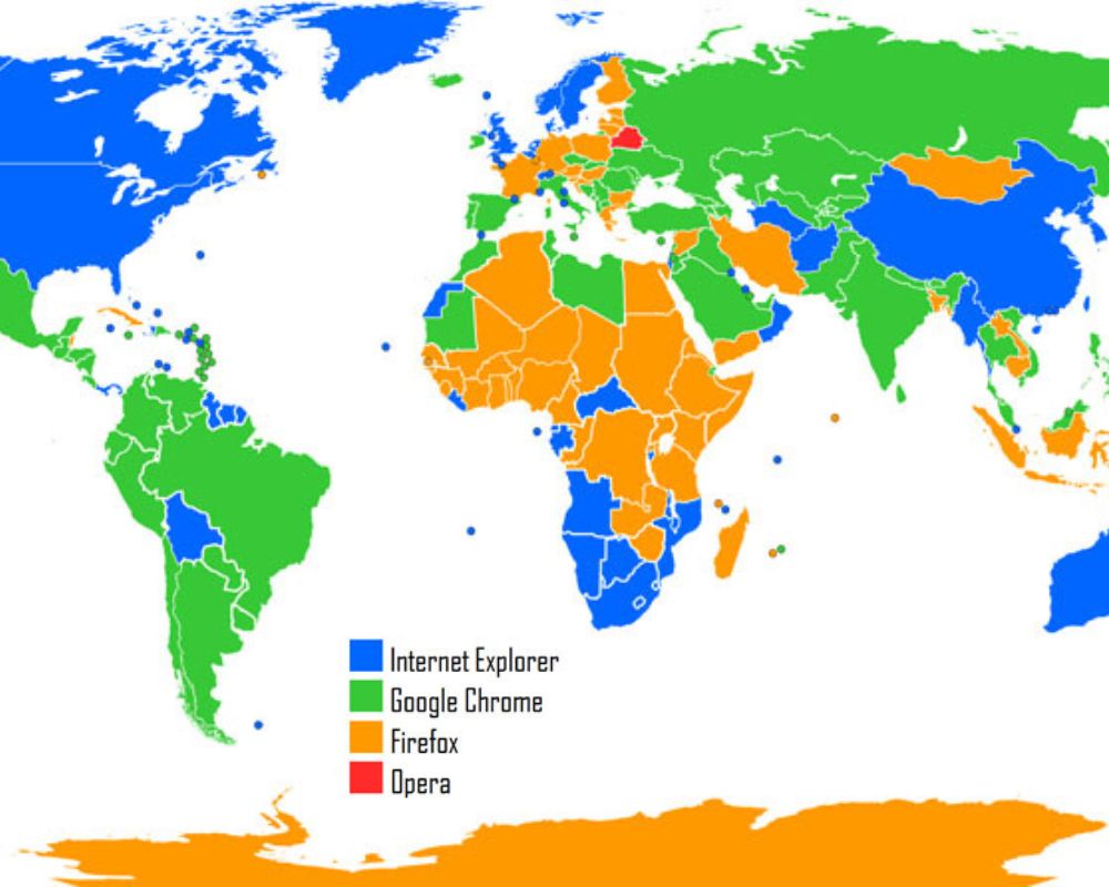
Firefox is still ever-present, with very little of the population using one of the oldest web browsers, Opera. The main noticeable difference between web browsers is their layout and perhaps different functions. Regardless, right now, 2.65 billion users use Google Chrome.
Snow Day
In these colder months, it’s interesting to see how much snow it usually takes for school to be canceled in the US. Sure, we’d hope that even a drop of snow would make them call off school, but it takes a little more than that.
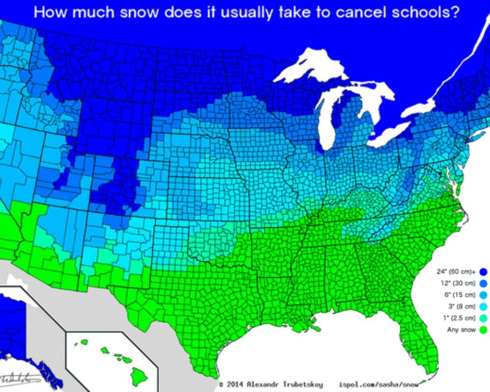
Largely in the northern states, it seems there needs to be a considerable amount of snow for it to affect schools. The further south you go, any snow at all often means schools get canceled. This makes sense, as they’re less likely to experience a lot of snow throughout the year.
Shared Name
If you live in Europe or know a lot of Europeans, think about how many people from each country you know share this surname. The surname ‘Smith’ is a common English surname deriving from the Anglo-Saxon era.
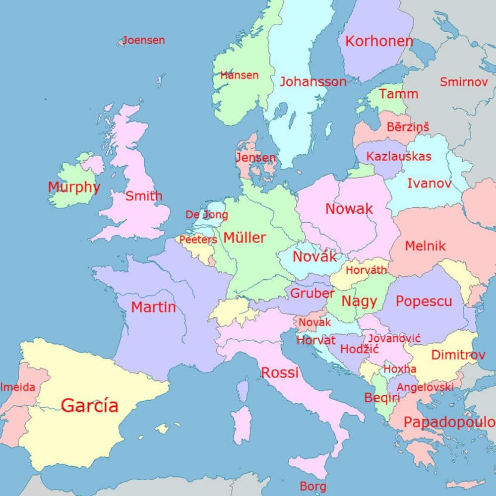
Heading into the rest of Europe, any Dutch surname with ‘De’ in it makes total sense. De Jong was, historically, a surname given to the younger of two sons as it translates directly to ‘the young’. Take a look at some other countries and do a dive into the history of the surname — it’s so interesting.
Jet-Setting Eagles
This map follows the journey of an eagle over 20 years, showing the way it traveled around Eastern Europe and Western Asia throughout its lifetime. Bear in mind that a Bald Eagle, for example, has a lifespan of 15-30 years; this map is following its whole life journey.
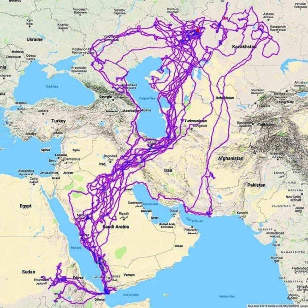
Birds are one of the most fascinating animals to track, purely because of how far they can theoretically fly. It would’ve been cool to see how this map correlates with different seasons and where the eagle migrated during the warmer and colder months.
Alternate World
Take a look at how our planet would look if we inverted land and water. It throws you off a little, right? It’s kind of a throwback to the Pangea era, where all the continents were once connected. Imagine if, in today’s world, all our land was connected. Oh, the chaos that would cause.
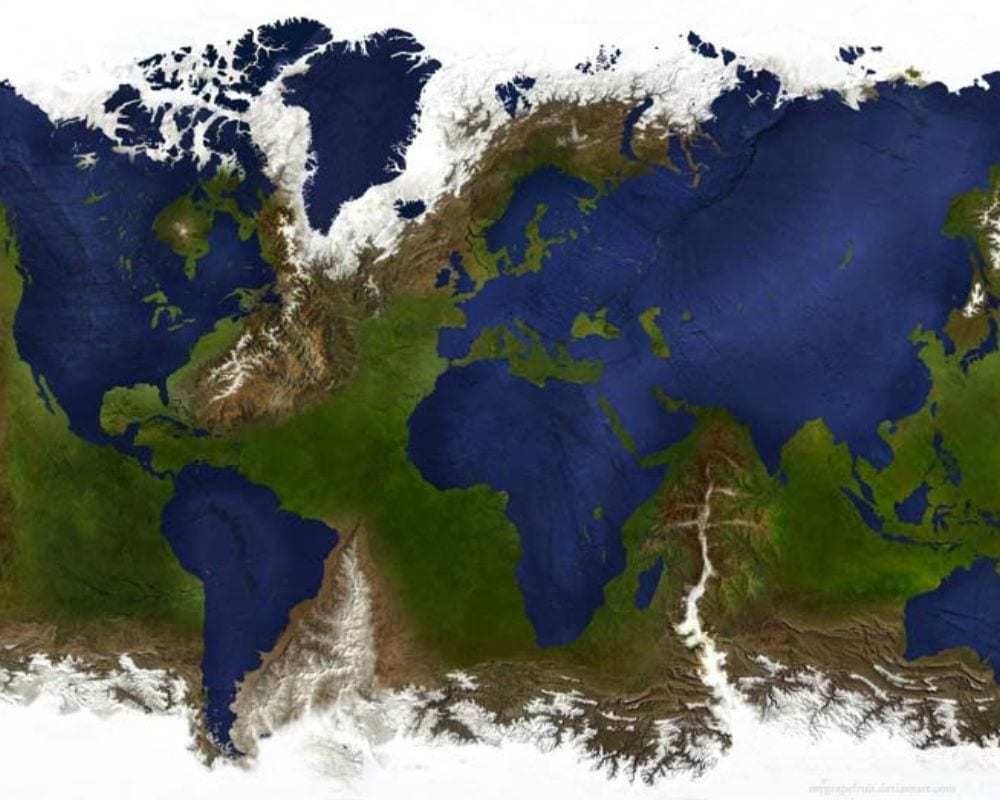
It also puts into perspective how much water there is on our planet when you look at it like this. Would we genuinely survive as a society with such little water, theorized in this map? Either way, it looks pretty cool, right?
Independent Packs
It seems that wolf packs really don’t like mixing together, huh? Like most mammals or any animals who travel in groups, they tend to stick to themselves. This map shows different wolf packs in a National Park and how they really stay in their own lane.
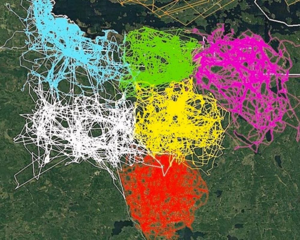
They must have really good senses to understand where their pack area starts and finishes, knowing well not to enter another pack’s territory. It does, however, seem that some, if not all, of the white pack have the guts to tread into some other territories.
Which Side of the Road?
Does this maybe settle the debate of which side of the road is the correct side to drive on? As you can see, the majority of the world’s countries drive on the left side of the road, while a few places — such as the UK, Australia, and some of southern Asia — drive on the right side.
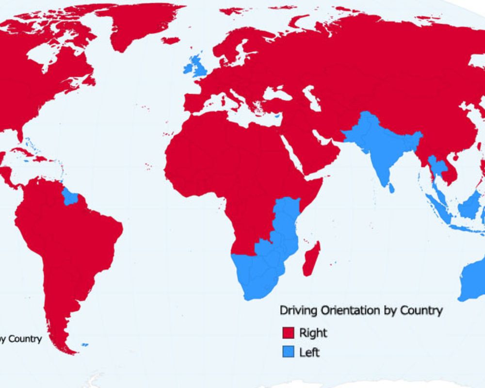
The statistics show that, in total, 165 countries and territories drive on the left. Only 75 drive on the right side, so maybe it’s not the right side after all? It’s suggested that the right-side driving came from Napoleon, who ordered his armies to drive on the right.
Spot a Flamingo
Much like the eagle and wolf pack tracking maps, here we can see where the majority of wild flamingos reside. Sure, a lot of us see flamingos at the zoo, but these areas are their natural habitats where visitors may spot them in the wild.
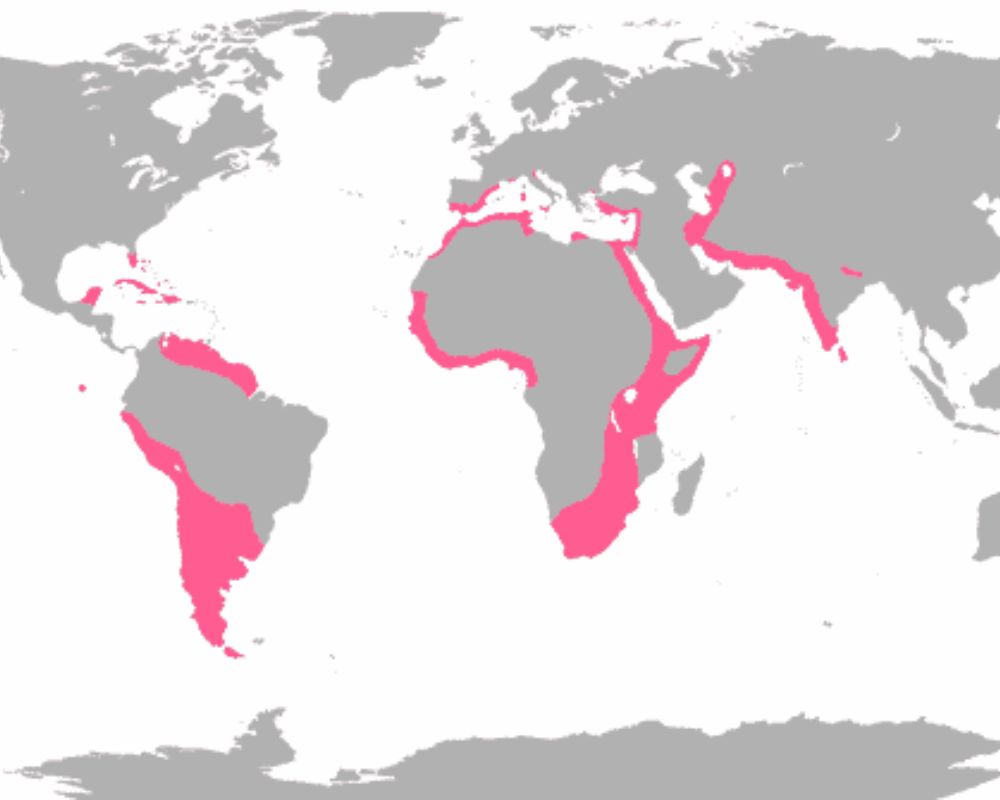
Flamingos seem to prefer warm environments and like having access to clean water to stay cool. So, that explains why they’re found in these specific areas. Hey, if you’re ever traveling the world, at least you now know where you can spot a wild flamingo.
Pretty Europeans
According to a Reddit thread in 2017, these are the countries that have the most attractive people throughout Europe. There is, of course, no definitive or scientific way to measure this, so general opinion has given us these interesting statistics.
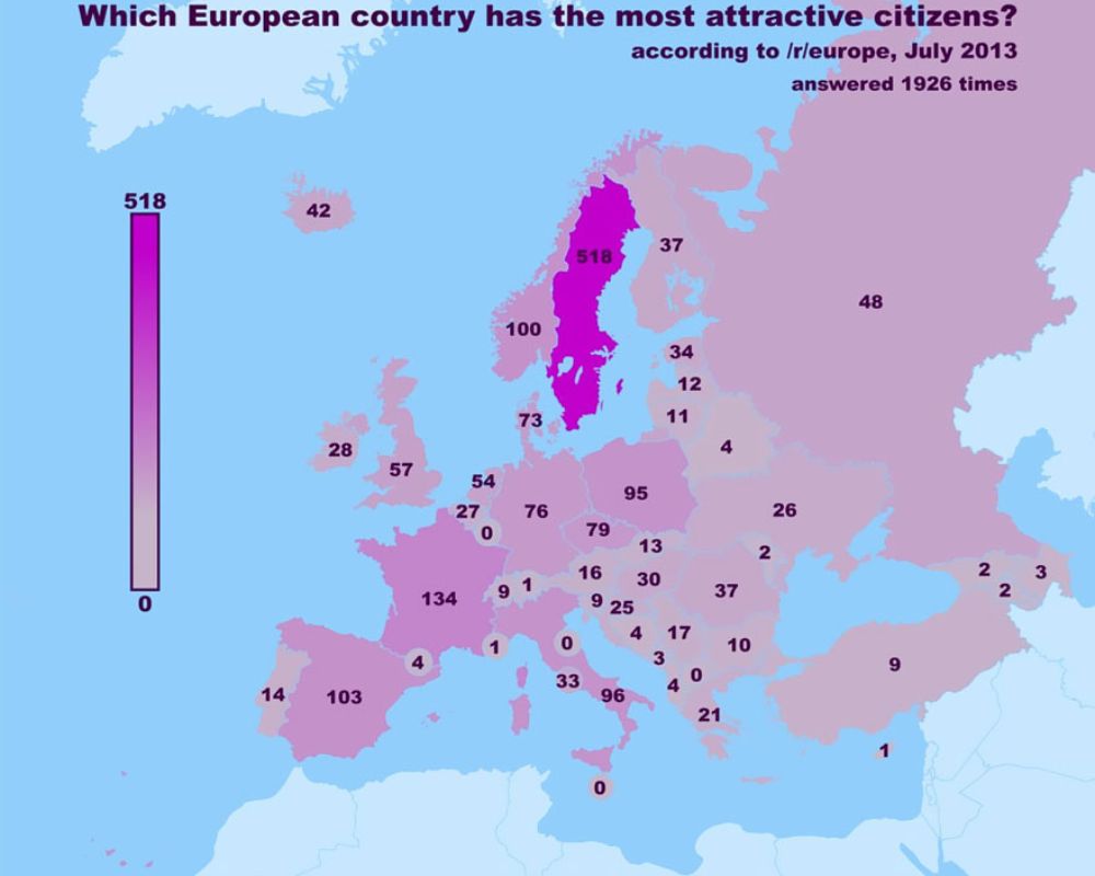
It seems that the most attractive people are in Sweden, situated between Norway and Finland where the votes were lower. The other votes placed French, Spanish, Italian, and Polish people high up. On the lower end of the scale, we’ve got Belarus, Moldova, and Liechtenstein.
Journeys in the Middle Earth
Here’s an interesting map for all of the Lord of The Rings fans out there. This shows the journey that Sam and Frodo took but from the perspective of the United States. For those not familiar with fictional maps, this really helps put into perspective how far they went.
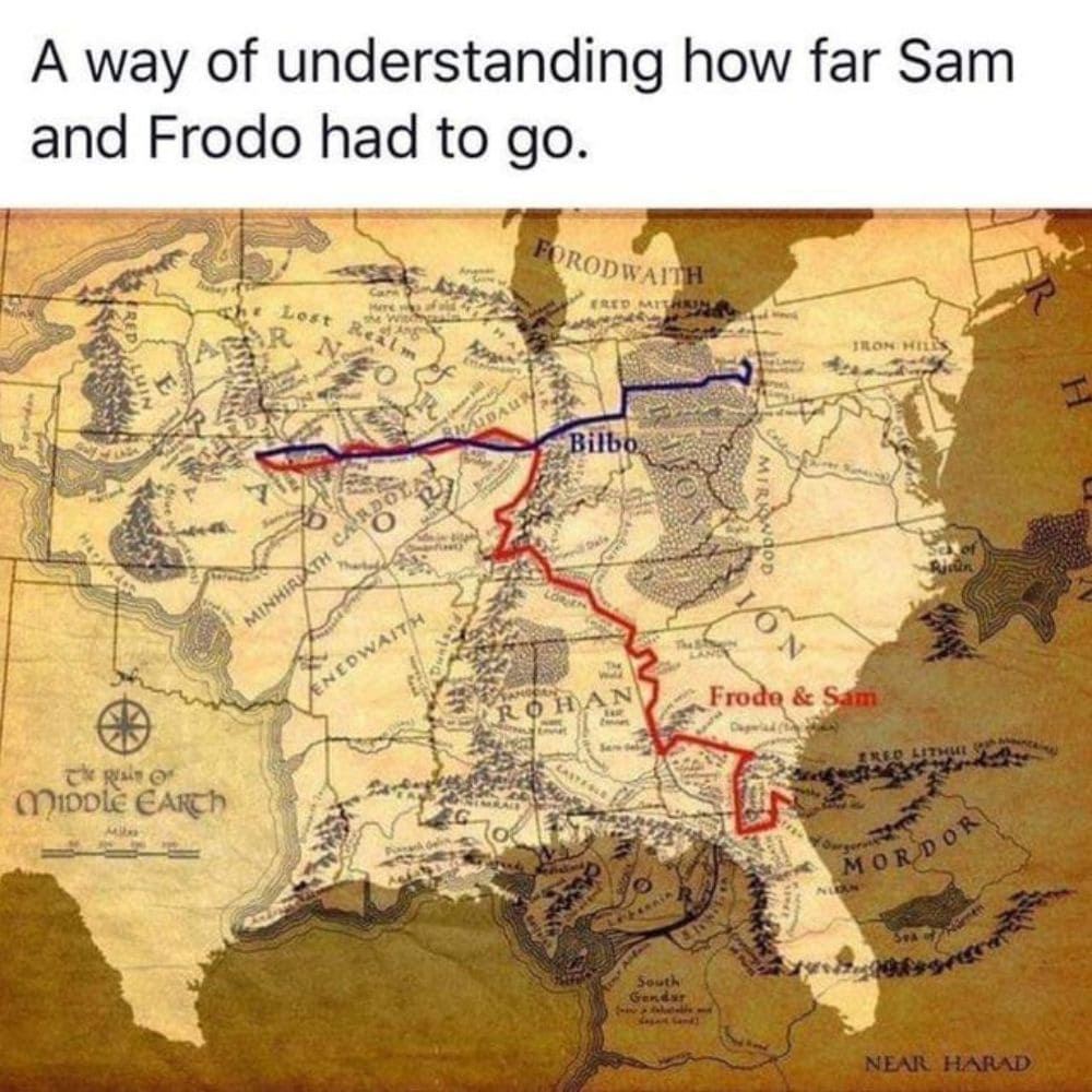
Can you actually imagine having to walk that far? There are a few different theories on how far they actually walked, but the general consensus puts it at about 1,350 miles, which would equate to 440 hours of walking.
Autocomplete
This map lays out what comes up when you do an internet search for each of the 50 states. The creator put down the word that came up first — besides obvious things like statistics, abbreviations, etc.
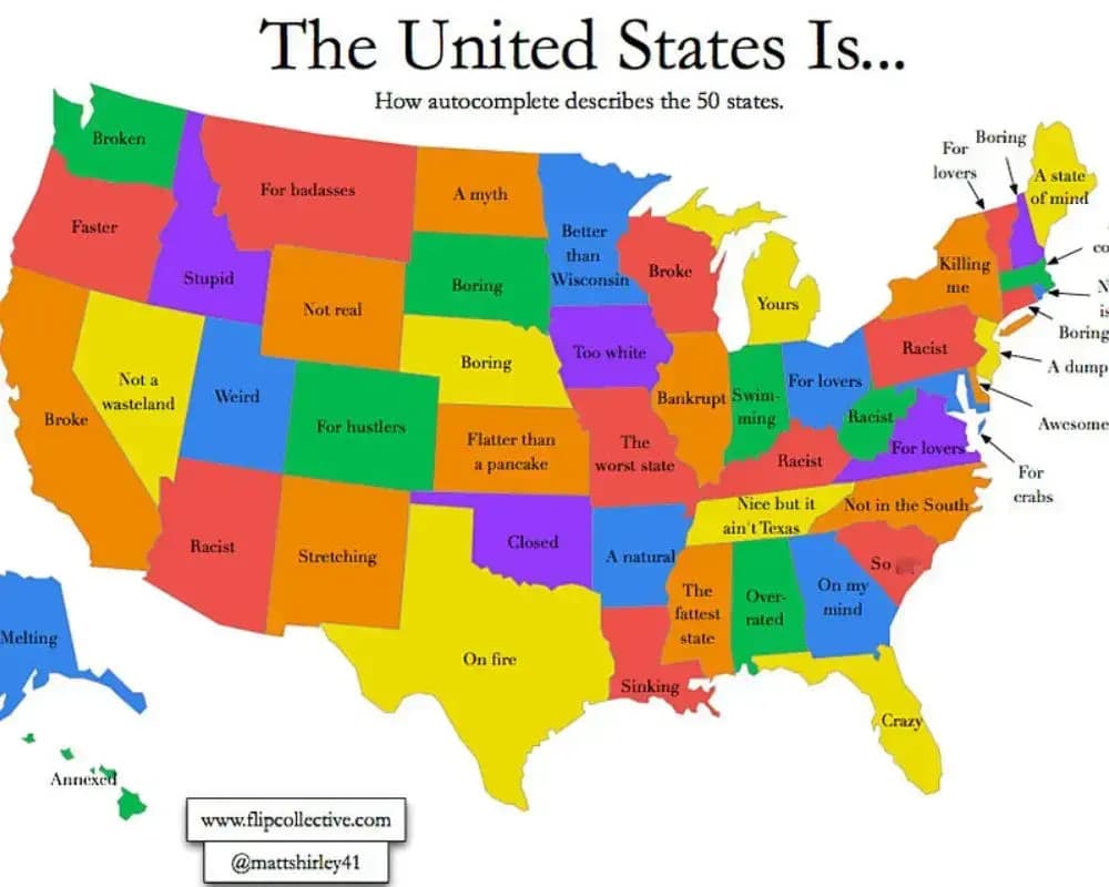
Take a look at this map. Do you agree with what the internet autocomplete search says about your state? Some of these are pretty funny. Autocomplete thinks North Dakota is a myth and that Missouri is the worst state in the country.
Longest Train Journey Ever
A lot of us travel by train all the time. Whether it’s a quick journey to the next town over or a few hours across the country, trains are pretty handy. But, did you know that this is the longest train journey you can take in the whole world?!
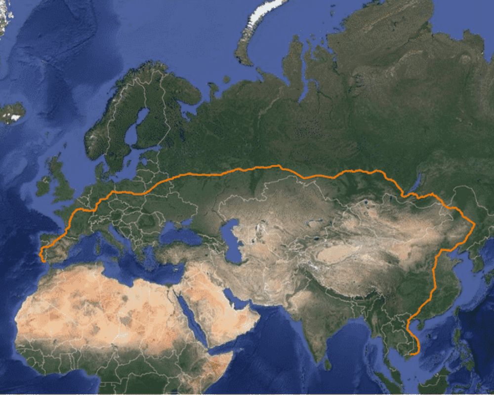
It may be the longest train journey, but it’s certainly not the quickest way to travel from Western Europe to Southeast Asia. Let’s take a look at where the train takes you. You’d start off in what looks to be Lagos, Portugal, and then slowly make your way through Russia before heading through China all the way down to Singapore.
English Invasions
It’s no surprise that there have been countless English invasions throughout history. This map lays out exactly which countries they’ve tried to take over. If you do the math, that’s 175 countries throughout the course of their invasion tactics.
If any country on this map is colored pink, that means at some point in history, the English have tried or succeeded in invading. Although it doesn’t give the context behind the invasions or at what point in history they happened, it’s still a pretty stark map.
Spotted Coats
Did you know that giraffes have different types of coats depending on where they are from? As it turns out, the unique markings aren’t just varied between individual giraffes. It’s all to do with which region of Africa they originate from.
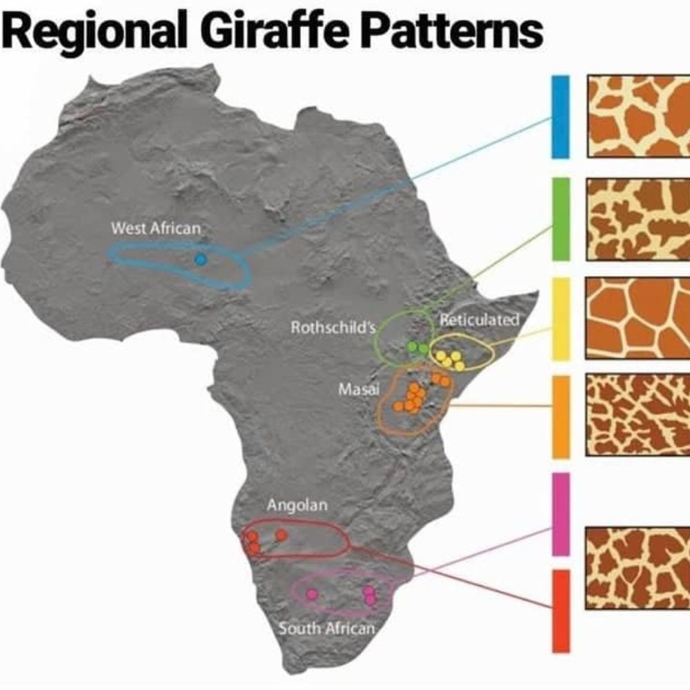
For example, giraffes from Somalia, Ethiopia, and Kenya have that traditional giraffe coat that we see. However, throughout South Africa and Nigeria, we start to see some more unique coats. The more you learn, huh?
Learn Your ABCs
By now, it should be common knowledge that different countries use different alphabets. If you didn’t know that, it’s time to get learning! The majority of Western culture uses the popular Latin alphabet.
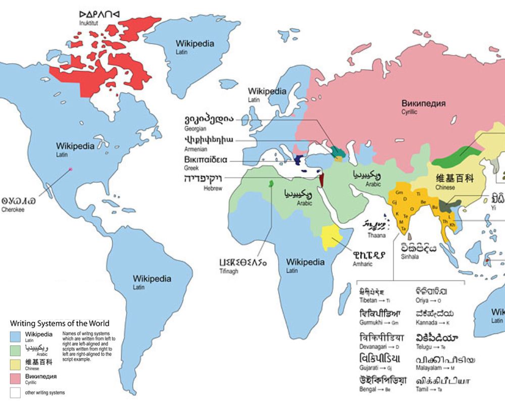
Throughout Eastern Europe and Asia, we see a bigger variety of unique languages. For example, the Chinese, Arabic, and Cyrillic alphabets are really popular in these regions. This map doesn’t show it all, though! The exact number is unknown, but it’s estimated there are up to 400 different alphabets.
Have You Really Been Everywhere, Johnny?
In Johnny Cash’s 1996 song “I’ve Been Everywhere”, the lyrics seem to suggest a multitude of places that Johnny’s been. This map is a little more fun, jokingly highlighting everywhere that Johnny Cash went, according to this song.
The song highlights 92 places throughout America, including Louisville, Alaska, Panama, and Kansas City. Did you know that in 2016, a man dubbed Everywhere Max embarked on a journey to visit all the places in this song? His journey finally ended in 2019, successfully hitting all the spots.
Concentrated Cities
So, let’s break this down. This interesting map shows the world’s population if they lived in one city (as of 2011). The comparison is shown on a map of America, showing both the scale of the human population and how small some of our most famous cities are.
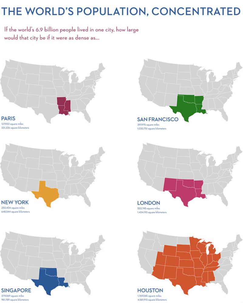
If you compare the infographic of Paris, France, with Houston, Texas, it gives you a bigger understanding of how small Paris is. Paris is just 41 square miles, with a population of just over two million as of 2019. Houston, however, is 672 square miles with an almost identical population.
Shrinking Virginia
Okay, okay — Virginia didn’t actually shrink. This map shows when Virginia reached its largest extent in 1609, completely encompassing a large portion of North America. Its colonial claims were insanely wild but soon shrunk, determined largely by military conquests of the American Revolution.
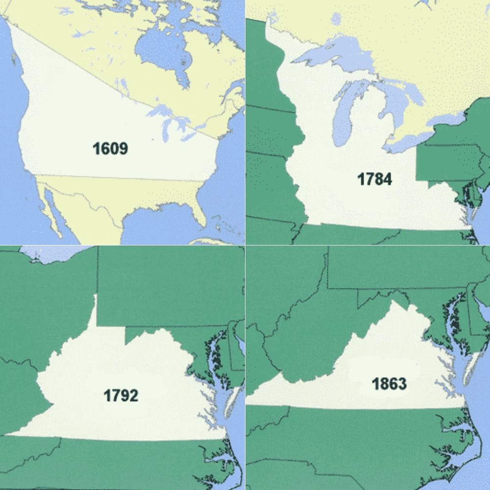
As the years went by, the territory they claimed slowly began shrinking. They claimed a large portion of Northeast America for a long period. It wasn’t until 1863 that Virginia became the size of what we know now.
I’m Lovin’ It
McDonald’s is primarily recognized as one of the biggest and most popular fast food chains. This map puts it all into perspective. As of 2022, there are a whopping 40,275 McDonald’s franchises across the world — but where are they?
Well, as you can see, the franchises are spread across almost the entire world, with a few exceptions. All countries in red have at least one, but more likely hundreds of franchises. If you’re looking for an interesting insight into how McDonald’s started, check out The Founder (2016).
Alaska’s POV
When you look at a map of the United States of America, you’ll often see Alaska as an inset on the side. This is because of how big Alaska is; it wouldn’t actually fit on the map. However, have you ever thought about how a map of Alaska portrays the rest of the states?
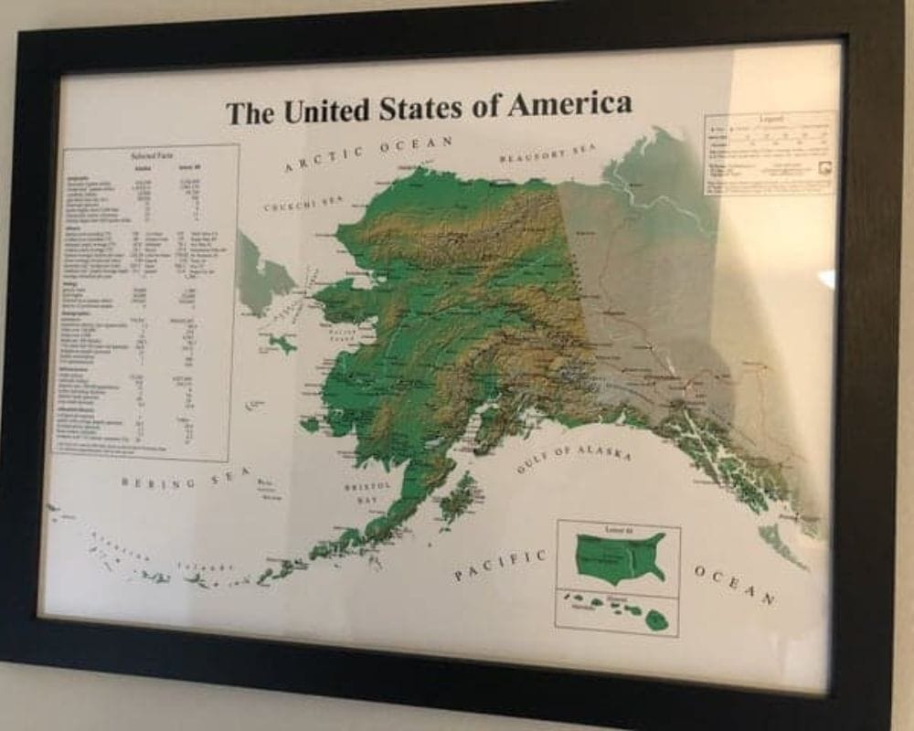
Well, they do the exact same, but in reverse. Alaska is roughly 656,654.36 square miles — that’s almost three times the size of Texas. So, they have a huge map of their state while showing the rest of the US as a super small inset.
America’s Shared Names
Earlier, we took a look at the most common surnames throughout Europe. Now, we’ve got a map of America’s most popular shared surnames. There’s certainly a wider spread of surnames across the states, but when you take a closer look, the coded colors show how common names are throughout the country.
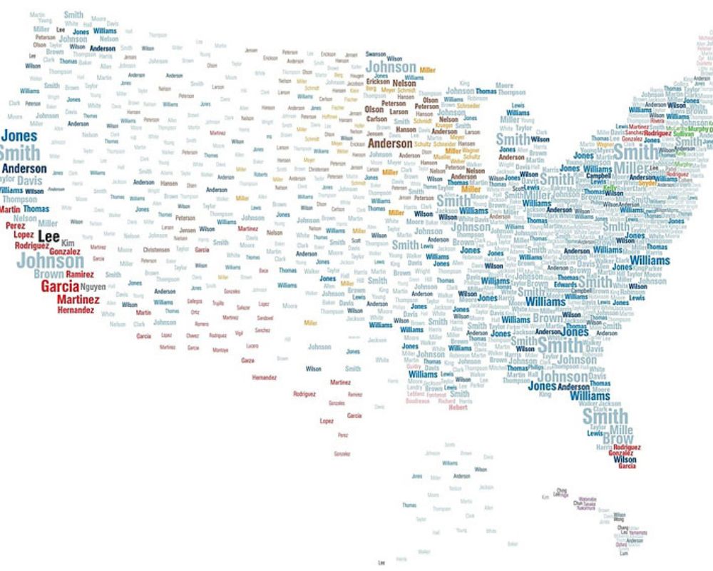
The statistics show that, like the UK, Smith is the most popular surname across all 50 states. We also see other common surnames — such as Johnson, Williams, Miller, and Anderson. How many of your American pals have these surnames?
How the World Once Looked, Apparently
As technology advances, we’ve grown a better understanding of what our world looks like. However, back in the day, it was a lot harder to figure out. Not only was the distance between continents and land more ambiguous, but plenty of unexplored areas were missing.
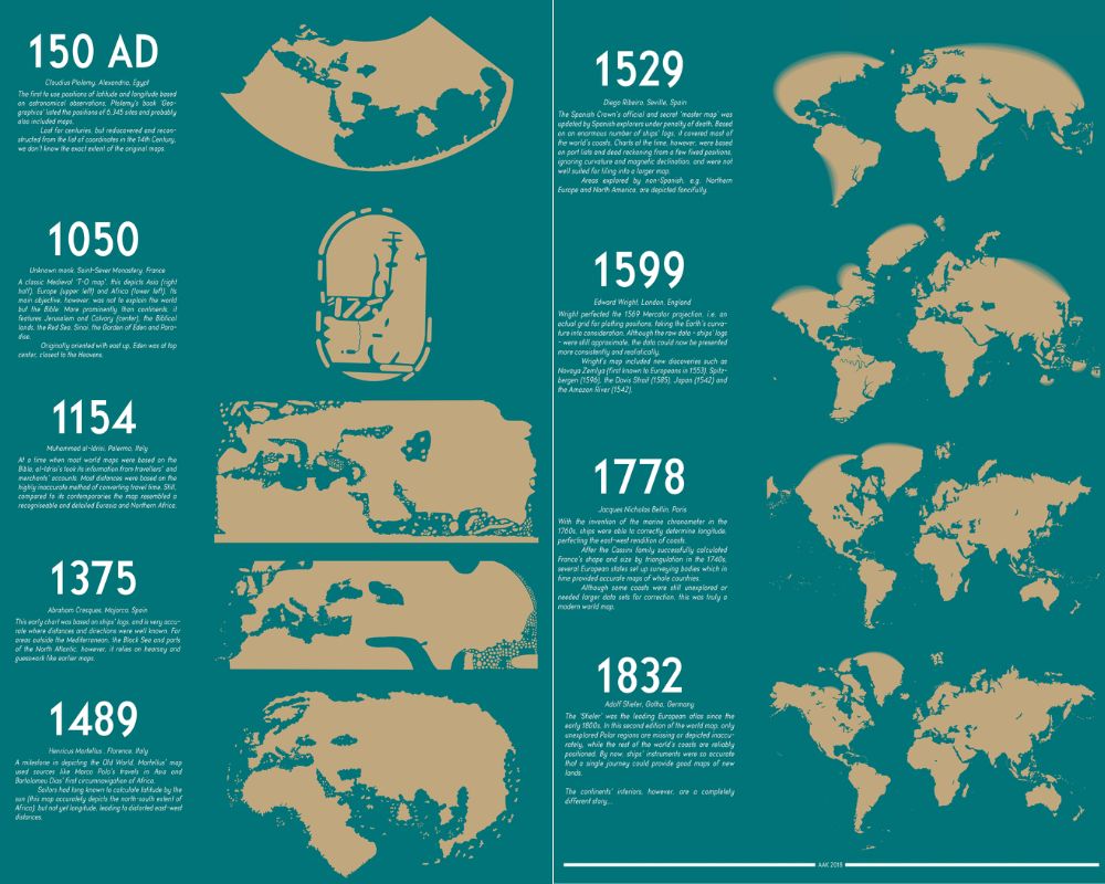
It wasn’t until 1375 that the world map started to look more familiar to what we know now. This was largely based on sailors’ logs, giving a more accurate idea of how far away lands were from one another. In 1832, the map became what we know today, only missing the undiscovered Polar regions.
Would You Live Somewhere Called ‘Last Chance’?
US cities weren’t always what we know them as now. New York City wasn’t a bustling bright-light fiasco, and Los Angeles wasn’t always the star-studded city. Not only have cities advanced incredibly, but their names have also changed along with them.
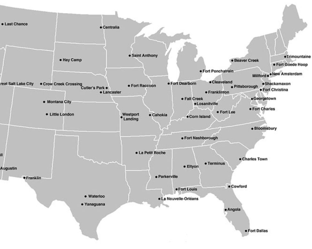
The majority of these old city names were either named after the people who colonized them or due to what they were located next to. However, some of them are just downright hilarious, like Fort Raccoon and Shackamaxon.
Fires Down Under
This is one of the more upsetting maps on this list. There’s no joy, jokes, or funny stories to coincide with what we’re seeing. This map is plain and simple. It depicts areas of Australia that have been affected by fires over the years.
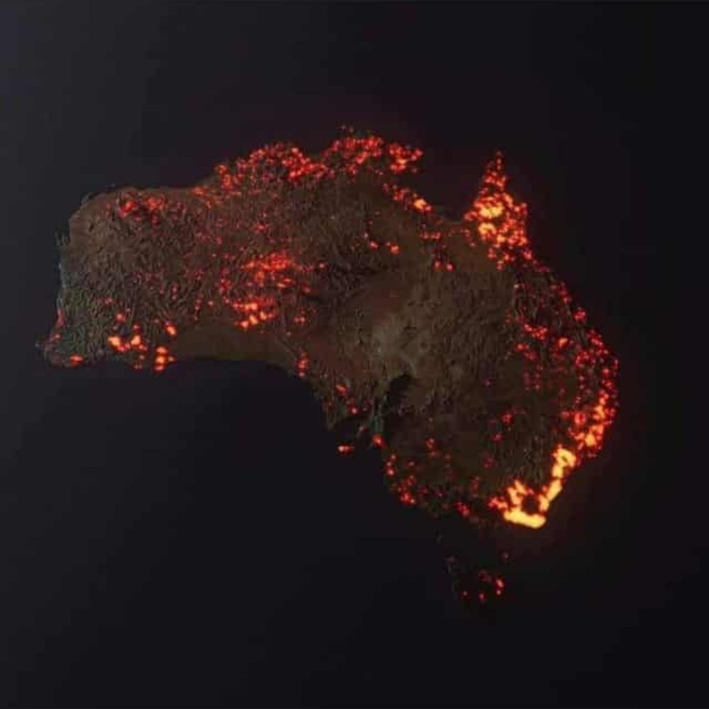
Bear in mind it’s not an accurate depiction of Australia right here and now. This 3D visualization by NASA merely shows places that have, at some point, fallen victim to horrendous fires. The majority of these fires are bushfires that can start for all kinds of reasons, perhaps naturally or through lightning.
The World’s Favorite Sports
As a society, we are, and have been for a long time, obsessed with sports–all kinds of sports, it seems. Whether it’s sports as a hobby or watching professionals play, we’re so into it. In this map, we get a little insight into which sports are popular in different parts of the world.
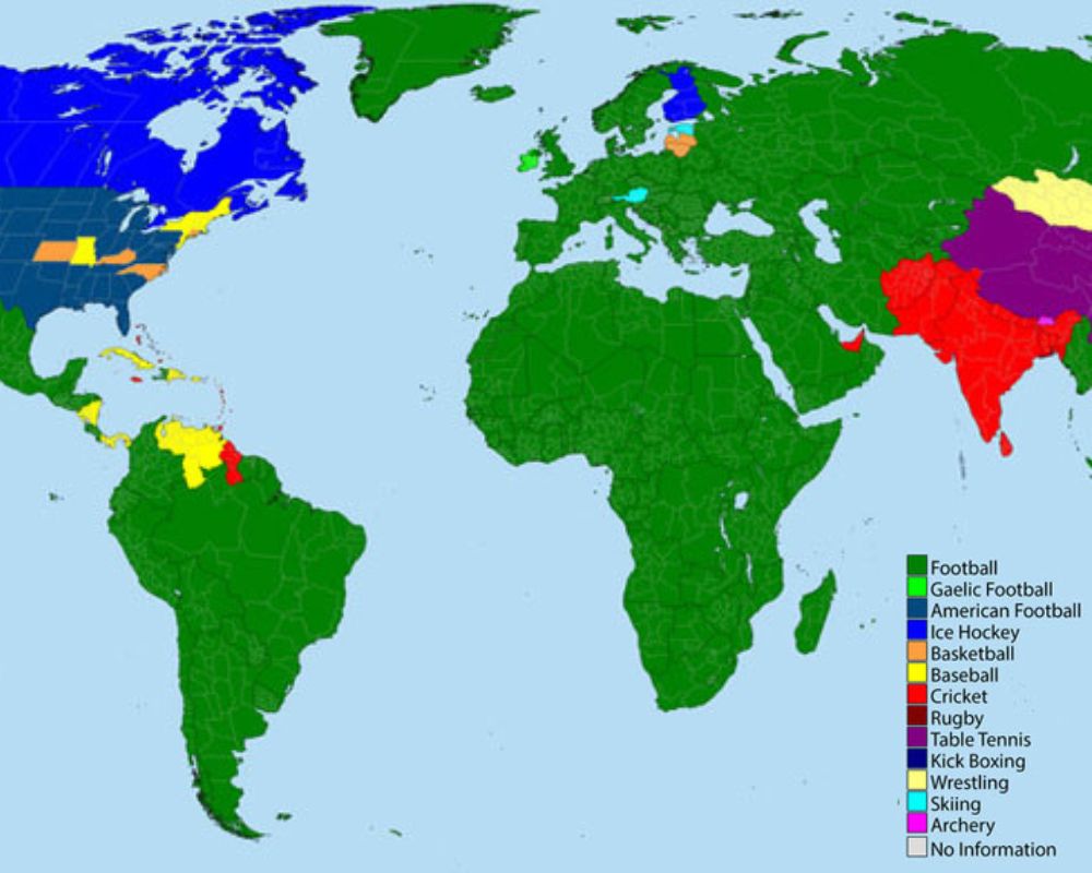
For the majority of the world, football (soccer) is the most popular. That makes total sense. After that, Cricket, Hockey, and American Football are the runners-up. Interestingly, there are little nuggets that indicate sports that are popular in that nation in particular. For example, skiing in Austria and table tennis throughout China.
Name Wars
Between 1960 and 2012, this map shows the evolution of which girl names were popular by state. Popular names for babies are often a direct result of pop culture. If you look at popular baby names from any era, it’s likely there’s an iconic character or celebrity that influenced it.
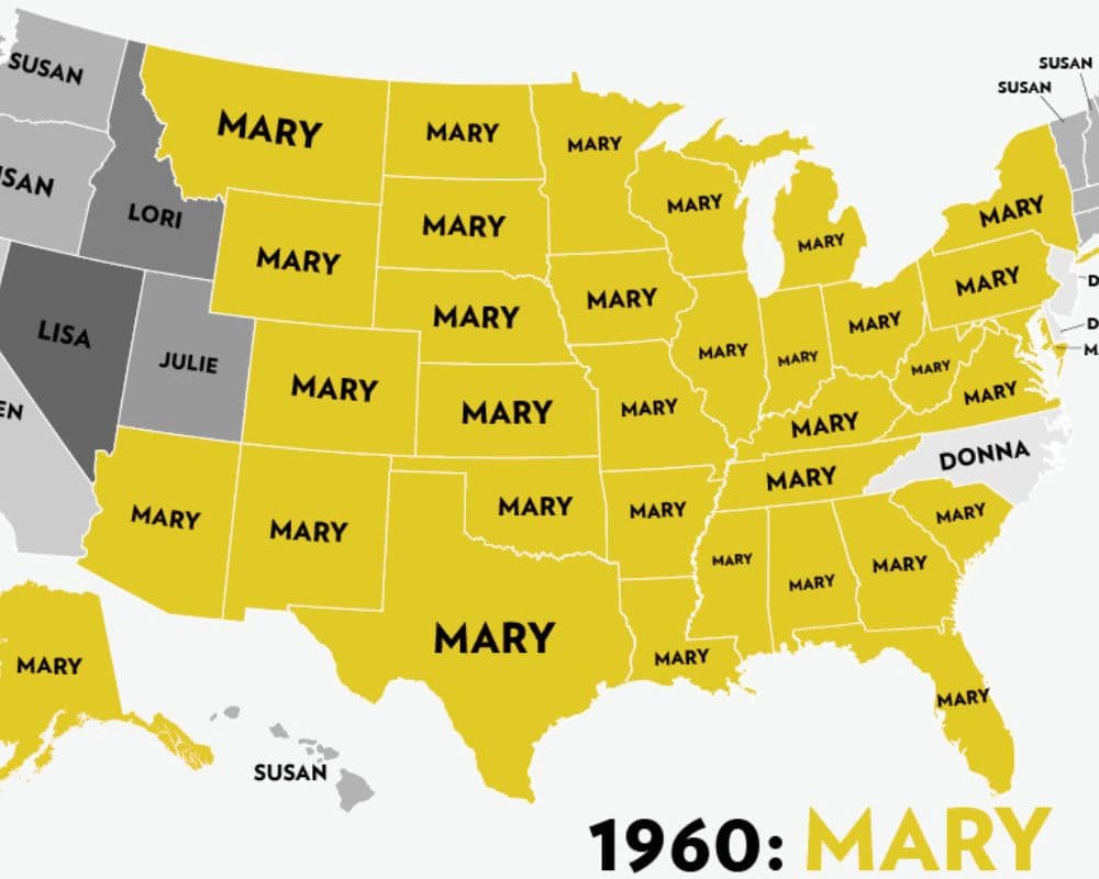
Up until 1969, Lisa was a stand-out name. Perhaps this was due to famous actresses like Lisa Gastoni or Lisa Grimaldi, a character from As The World Turns, a popular show in the ’50s and ’60s. In the ’70s, Jennifer took over, perhaps influenced by the 1970 movie Love Story, with the lead named Jennifer.
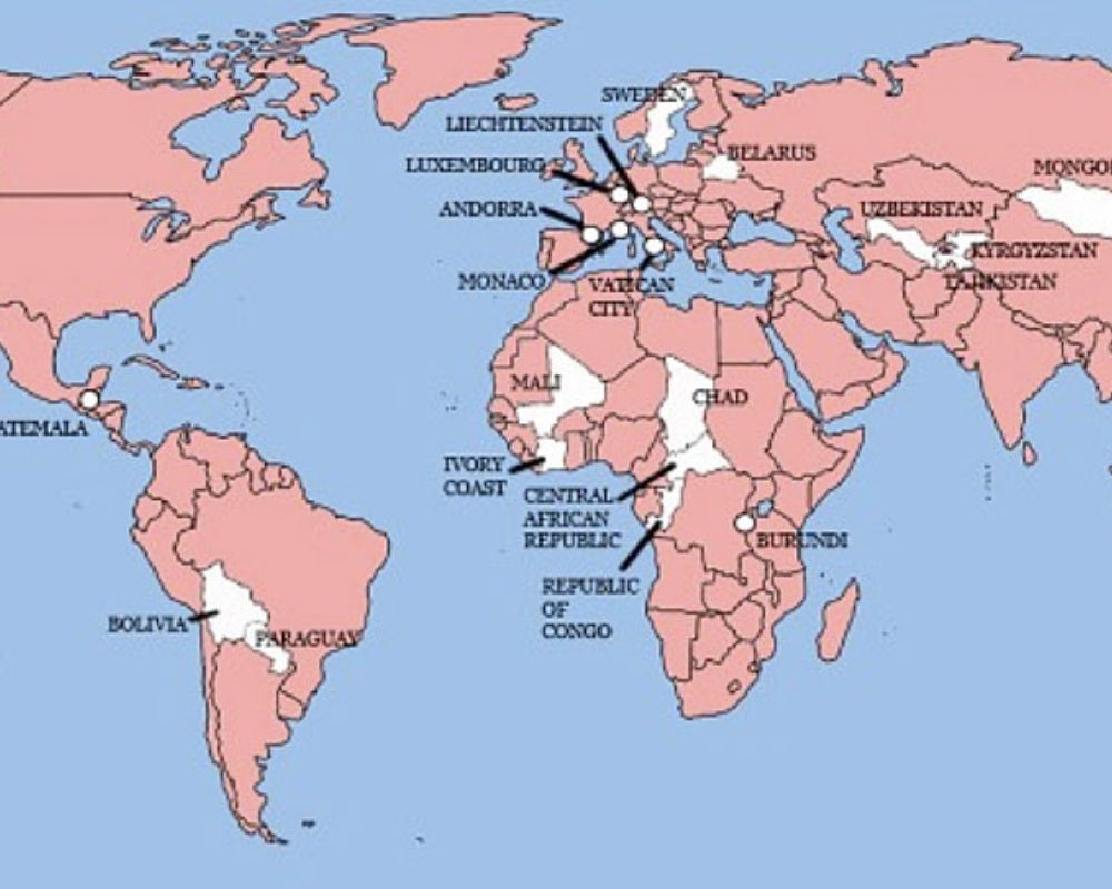
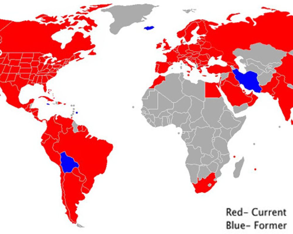
Units of Measurement
Much like which side of the road is the right side to drive on, countries are often divided on which units of measurement are so-called correct. As shown on this map, there are currently only three countries that still use the imperial system — Liberia, Myanmar, and, of course, The United States of America.
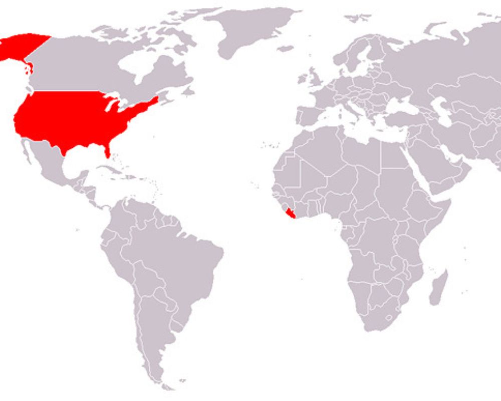
These countries have stuck with the imperial system, such as inches, yards, gallons, miles, etc. Every other country on this map, grayed out, uses the metric system. In the past, the US did try to convert to the metric system, but for some reason, it never stuck.
Personal Journey
This is certainly one of the most heartwarming and sentimental maps we’ve ever seen. This person made a personalized map for their brother, highlighting the motorcycle journey they ventured on together for his birthday — how sweet!
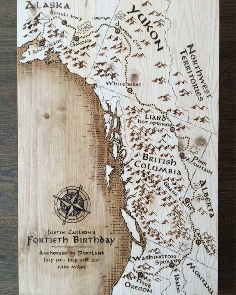
The pair traveled from Anchorage to Portland over a 10-day period, and the map also pinpoints the places that they stopped to visit along the way. Doesn’t this map kind of remind you of something you’d see in The Lord of the Rings? The visuals are timeless, nostalgic, and a little folkloric.
IQ Average
This map could certainly be an insightful commentary on which areas of the world are, unfortunately, lacking access to proper education and resources. It seems that Western cultures score higher on this map, while some underdeveloped countries score lower. It’s a useful insight into where our resources need to go.
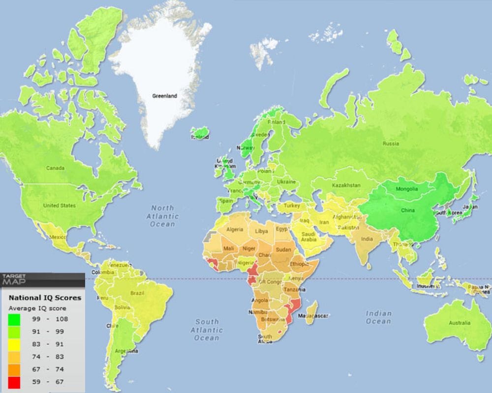
Worlddata made an interesting comparison, using a similar map, to show the correlations between where the lower IQs were and annual income, including the cost of education. Side note — IQ is often determined through tests and your ability to perform on the spot, so it’s not a thorough representation of how smart someone is.
Population Control
If you’ve ever been to Manhattan, New York, you’ll know how overwhelmingly busy it is there. To put it into perspective, this map shows how dense the population is in comparison to average-sized states.
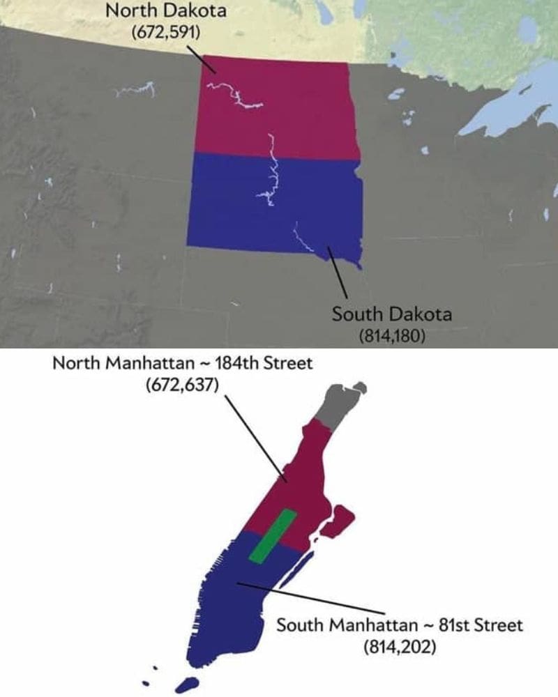
Interestingly, North Dakota, at the time of the study, had an almost identical population to North Manhattan. How crazy is that statistic when you get to see it visually? Let’s do a quick size comparison. North Manhattan is around 12 square miles, whereas North Dakota is just over 183 square kilometers.
Russia’s Unfriendly Countries
So, here’s a list that was first published by the Russian government, calling out countries they claim are doing unfriendly stuff to Russia, its businesses, and people. If your country’s on that list, there are some restrictions slapped on — like limits on trade, currency stuff, and even how many diplomats they can have in Russia.
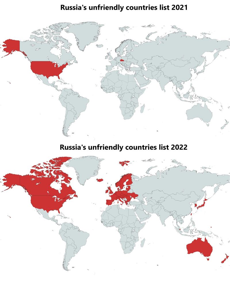
It started back in May 2021 with just the U.S. and the Czech Republic on it, but it ballooned to 49 countries in 2022. We wonder why…
Published Expressions
Freedom of speech is a tricky thing worldwide, especially when it comes to the press. This includes any form of journalism, such as magazines and news broadcasters. In some countries, there’s a limit on what opinions you can or can’t share. Other countries are more free.
Interestingly, there’s a lot of red on this map, which means that there are strict regulations on what the press can publish. A lot of Western cultures — like the US, UK, and Australia — have okay but slightly limited freedom. In Canada and a lot of Scandinavia, they can pretty much say whatever they want.
Life Is a Highway
If you’ll let our Rascal Flatts pun slide, let’s talk about this map. This map highlights the highway routes across America, starting from Route 1 all the way up to Route 730. It’s fascinating how many there are. Granted, it is a huge country.
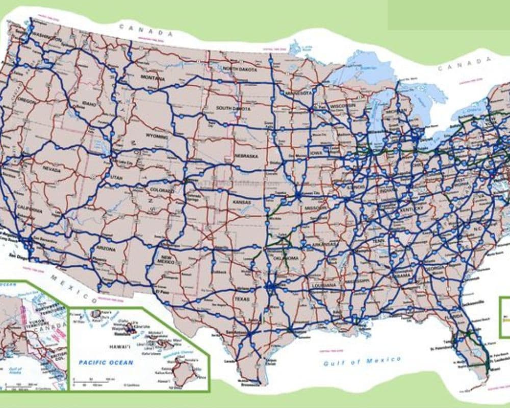
The routes build an almost perfect map of the country itself, highlighting how far spread their highways are. It’s suggested that the first 100 were built independently, and then anything above 100 was added in at a later time to make traveling between states easier.
Worldwide Weight Issues
Obesity is a pretty common issue worldwide, with over 650 million adults having a BMI over 30 in 2022. This map highlights where the most prevalent weight issues are, highlighting various countries where obesity may be a problem.
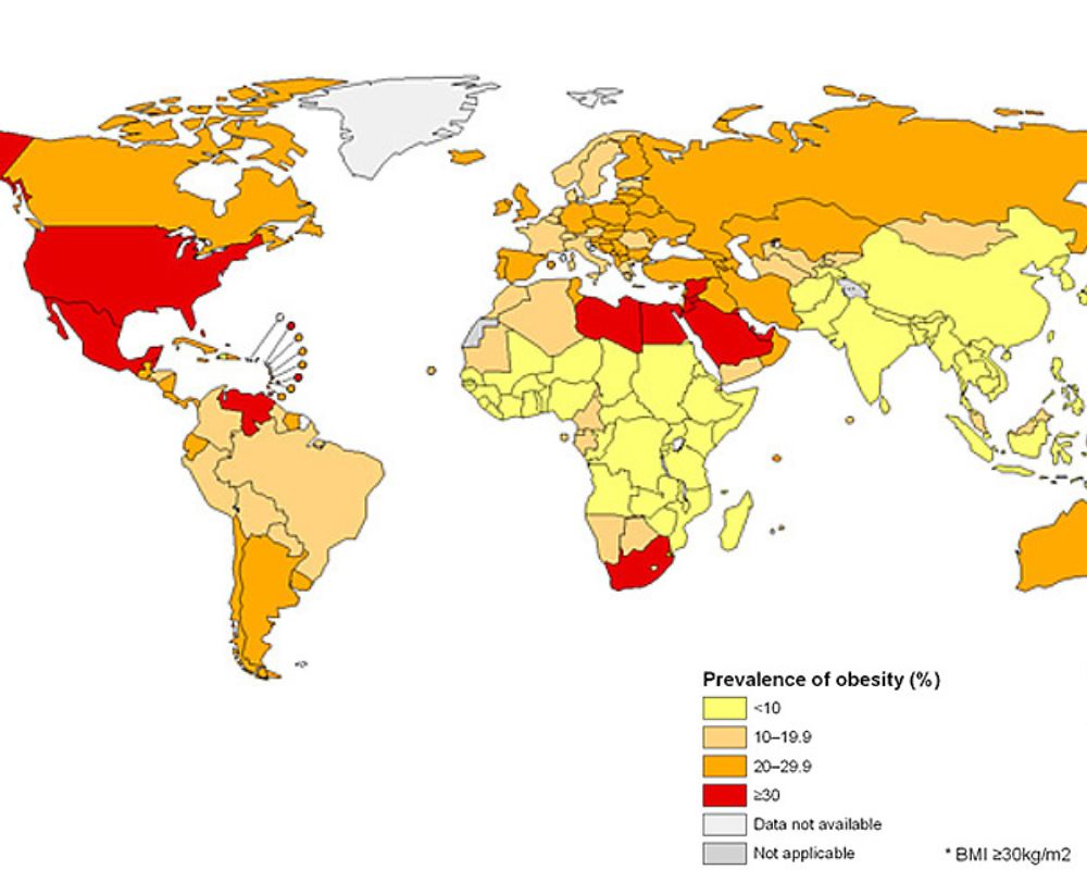
Sure, there are plenty of things we can do as individuals to maintain our BMI healthily, but countries working to create a better and healthier food environment wouldn’t go amiss. The most prominent issues seem to be in the US, Saudi Arabia, and a few countries across Africa. The majority of Asia and Africa seem to have fewer issues with obesity.
East of Michigan
We suppose this is more of a fun fact than anything crazily interesting, but did you know that the entirety of continental South America lies east of Michigan? There are plenty of things that throw you off about the layout of Earth, and this is certainly one.
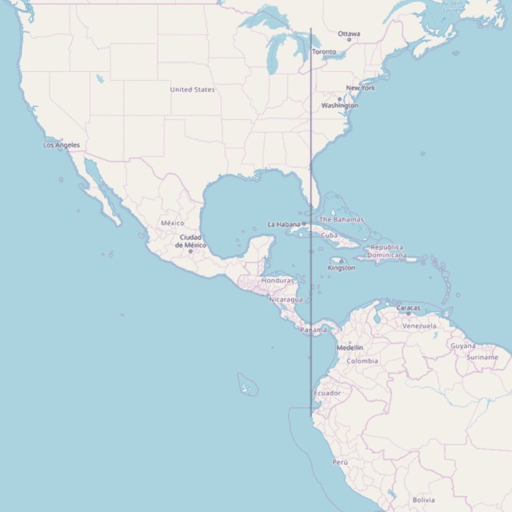
A standout South American country is Peru, which just about fits in that east of Michigan line. The only exception is the Galápagos Islands, but this map only considers countries in continental South America.
The Seven Deadly Sins
We’re all familiar with the seven deadly sins, right? By the early 13th century, these seven sins were being ingrained into people’s lives as key sins to avoid. These maps of the US show where these so-called sins are most often committed and where they’re cleared as being innocent of said sin.
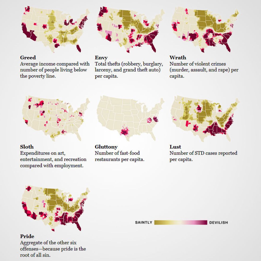
My personal favorite is the map of gluttony, highlighting which specific areas have the most fast food chains. We’re looking at you — Texas, Virginia, North Carolina, Kentucky, and Tennessee. Greed is interesting, too. It highlights areas where the rich thrive and the poor really suffer.
Fertility Rates
This map provides a loose interpretation of what countries have the highest fertility rates. It judges it based on the amount of children, on average, that a family has. Many countries in Africa seem to rank high, with up to eight children per family.
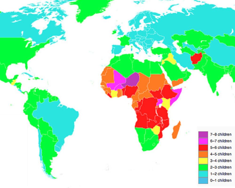
The rest of the map seems to fall anywhere between one to three children. Two to three children actually remain a common amount of children for families, but according to a 2020 census, future parents are keen to have only one child.
New Perspective
Here’s an alternative perspective of what the world looks like using a Mercator projection. These types of projections were often used in maps for sailors to navigate around the world more easily. The process lays the map out as flat as possible in a cylinder shape, intersecting longitude and latitude at a 90° angle.
There’s a lot to unpack here, but it seems to shrink down Europe and the Americas while enlarging Africa so much that it almost completely disappears off the map. If you take a closer look, Europe remains the ‘right way’ around, while other continents have rotated.
Time in Antarctica
Did you know that Antarctica has a whopping nine different time zones? Any country that has a large distance from west to east, such as Russia, tends to have at least two time zones to align with the sun.
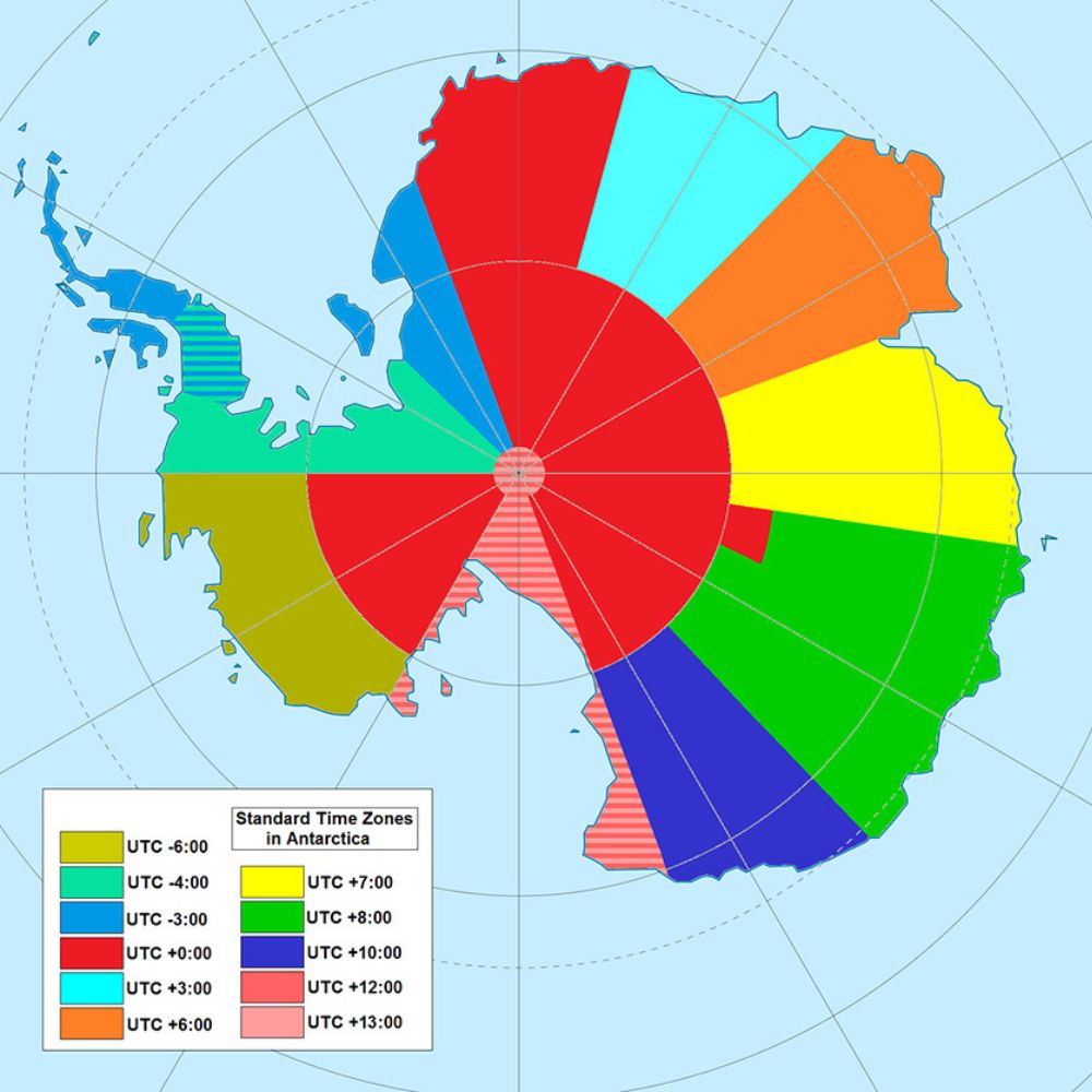
If you were all the way in the west of Antarctica, the east of Antarctica would be a crazy 15 hours ahead of you. Most regions of the continent align with other time zones (i.e., GMT, AEST, and ART).
Tourist Friendly
If you’re big on traveling, it may be interesting to know which countries are most welcoming towards tourists. Countries in red, like Russia and Bolivia, will be less welcoming. Places big with tourists, who are welcomed by locals, are countries such as Canada, New Zealand, and Belgium.
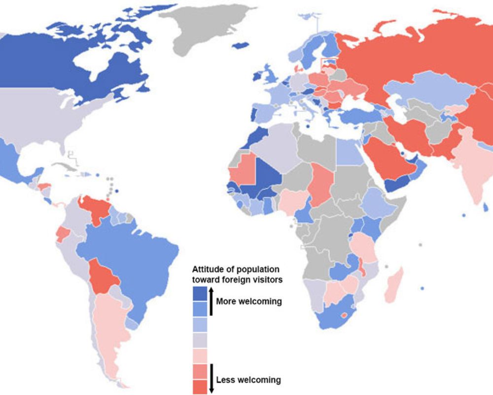
We do wonder how they measure the level of welcomeness. Perhaps with surveys or personal travel experiences? It’s a very hard thing to measure, but nonetheless, keep this in mind when you’re planning your next trip!
Lightning Strikes
This map, developed in 2001, shows the areas in which lightning strikes most commonly occur. It seems that lightning is more likely to strike in Central Africa, South America, and the Himalayas.
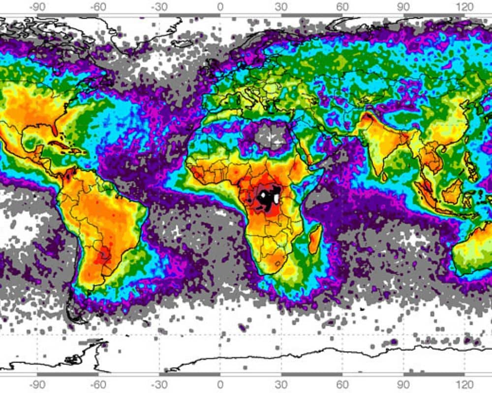
Throughout Europe and the majority of Asia, there’s a lesser chance of lightning striking. Of course, throughout the seas and borders of countries and continents, the risk of lightning is pretty much slim to none.
At school, we’re taught about all kinds of traditional maps, whether it’s a world map, maps of specific continents, or a map to help us learn the 50 states. We’re used to seeing maps in their more conventional sense. To switch things up a bit, here’s a compilation of unique and interesting maps that will change your whole perspective on the world.